My esteemed colleague Sergio has a great writeup about web application performance – specifically around Javascript and React. If you’re interested in working with Sergio on this type of stuff at scale (WordPress powers 43% of the web), Automattic is hiring – just mention you are interested in working on performance.
Author: Barry
-

Pingo – Monitoring the Internet One ECMP Link at a Time
Last week, a few of us from Automattic attended NANOG in San Diego and Tyler from our Netops team gave a great talk about Pingo, a tool we have written and released under the GPL. We use Pingo to detect (and sometimes predict) network congestion across the Internet. We then use this data to make real-time automated routing decisions between our data centers on six continents. While we could have done this same thing using Artificial Intelligence and Machine Learning, it was much simpler without it. If simplicity at scale interests you, we’re hiring.
-

Data Center Heatmap
At Automattic, our systems team manages over 10,000 physical servers located across 30 data centers on 6 continents. As our compute density has increased from 24 CPU threads/RU in 2013 to 128 CPU threads/RU in 2022 the maximum thermal thresholds have decreased. Older, less powerful servers could operate with inlet air temperatures up to 42C (107.6F) while newer servers trigger CPU throttling at much lower temperatures of 35C-37C (95F – 98.6F). Normal data center operating temperatures tend to be between 20F-25C, but cooling failures are somewhat common (they even affect Google), so we have to monitor temperatures carefully.
We are big fans of Prometheus and Grafana and for a few years we have had temperature graphs that look like this.

This graph shows the temperatures of some servers located in our data center in Johannesburg, South Africa over one week. The colored lines represent individual servers and the bold, red line is the average temperature in the rack.
We get this data from our servers inlet temperature sensor using ipmitool. I thought it would be interesting to see this data visualized a bit differently, and Grafana has a Heatmap graph type that made it pretty easy.
First, we simply want to graph the temperature by location for a given datacenter. In PromQL this looks like
avg by (location) (ipmi_inlet_temp{dc="$DC"})locationincludes the rack identifier and the location in the rack. For example a location of101-10would mean Rack 101, RU 10. We store this information is our data center asset management system (which is a colon separated file) and it gets added as labels to all Prometheus metrics. By choosing theHeatmap (New)graph type and configuring some basic graph options, Grafana allows us to create a graph which shows the same data as our original graph, but in a different, and more useful way. We can easily see that the top of the rack is warmer than the bottom which is to be expected since the cold air in this facility comes from the floor. We can also see that temperatures have increased slightly over the past week, which is not ideal, but they are not at dangerous levels.
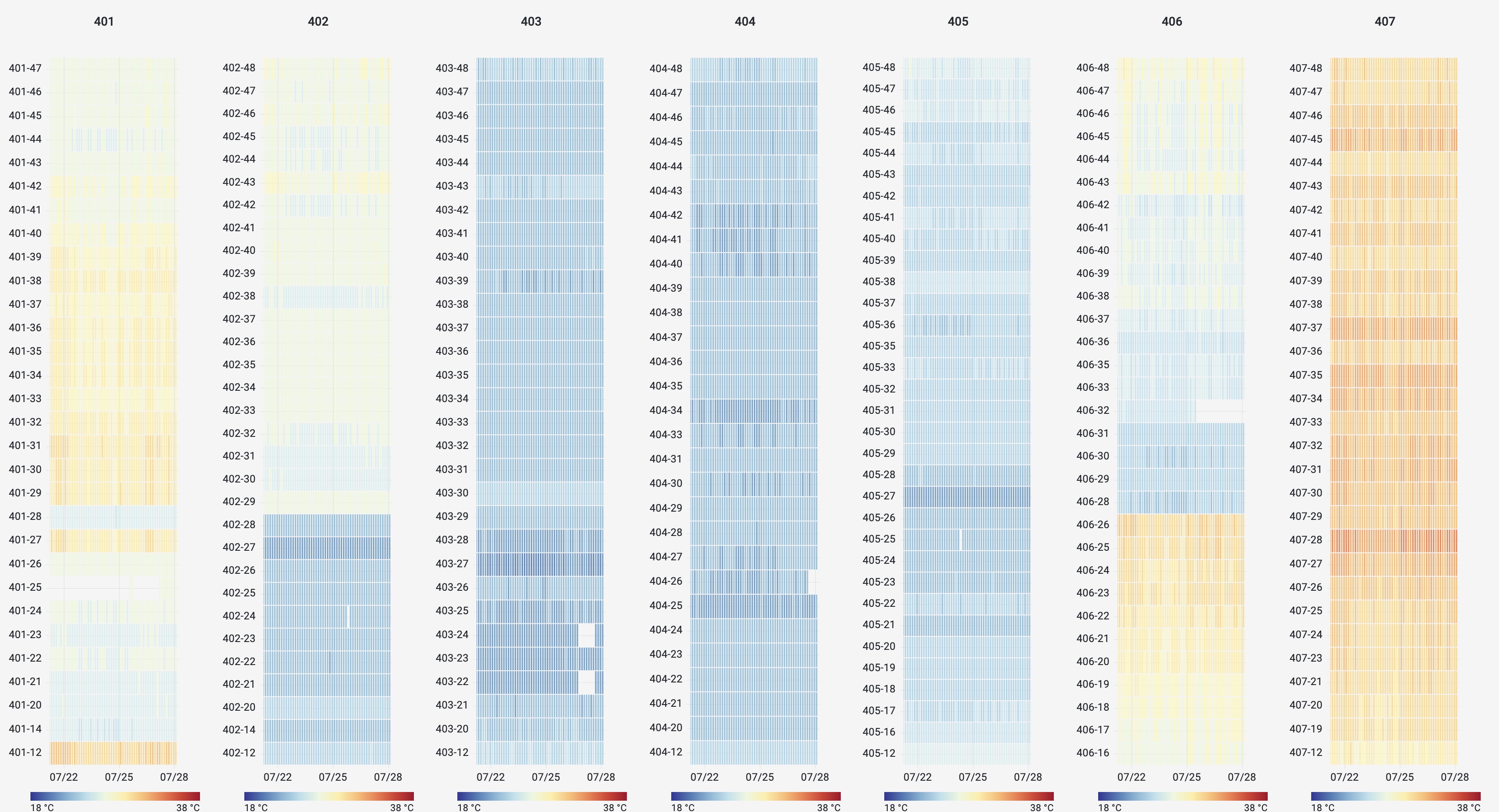
JNB We can contrast this with a rack in Milan, Italy where there was a cooling outage which caused the servers operate beyond their intended temperature threshold for a period of time:

Milan, Italy Using the same data and graph options, we are also able to easily create heat maps of entire rows of racks to visualize airflow management and identify areas for potential improvement. Here is a row of racks in a data center in Los Angeles with poor airflow management. We can see the racks at the end of the row suffer from increased temperatures due to air leakage from the hot aisle to the cold aisle.
Los Angeles When can contrast this with data from a set of racks in Amsterdam which have much better airflow management
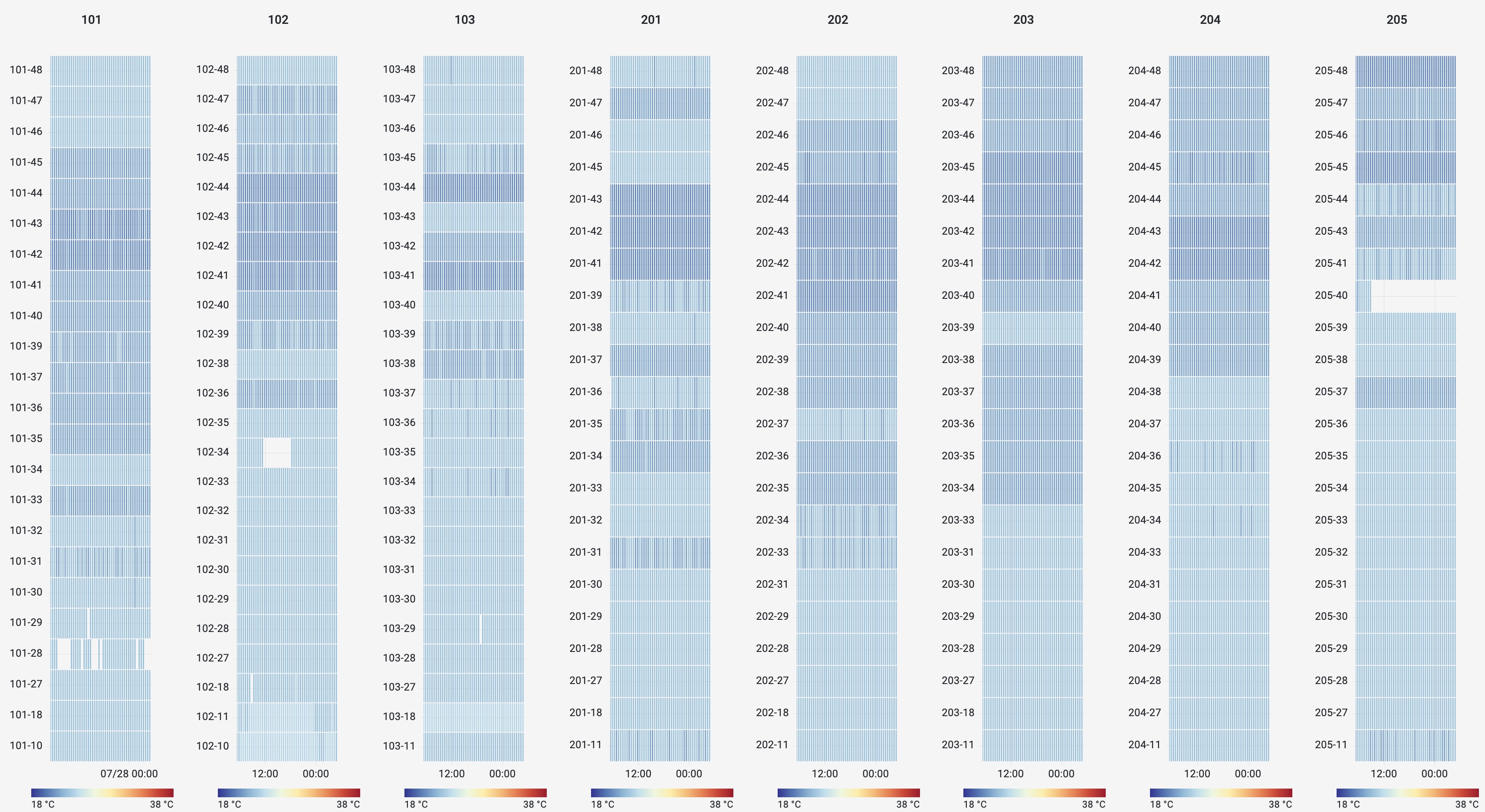
Amsterdam I hope this post shows how easy it is to create cool(!!) and useful heat maps using Grafana, Prometheus, and a little bit of time. If this sort of stuff interests you, Automattic is hiring!
-
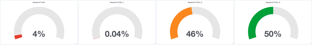
TLSv1.3
We enabled TLSv1.3 support on the WordPress.com API today and it’s already 50% of total traffic.
-
David Newman Scale Conf
Earlier this year, my colleague David Newman gave a great talk about the systems that power WordPress.com and our container-based VIP platform at ScaleConf in Cape Town, South Africa.
